
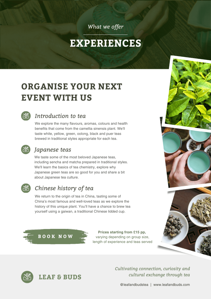
Leaf & Buds is a tea company I started with a friend; we host tea experiences, guided tastings and bespoke events centred around loose leaf tea. I created our name and logo, designed and built our website, and in collaboration with my co-founder Kartini, designed the visual identity for our brand.


Read about the process of designing our name, logo, and visual identity below.
Our name
Leaf & Buds grew out of a friendship between two buds with a shared love of the camellia sinensis leaf. Kartini and I met at our local tea house, and from our earliest conversations it was clear that tea plays a very similar role in our lives – more than just a drink, it’s a means of connection with people and cultures across the world.
So we thought it would be only right to acknowledge the root of our bond in our budding tea business’s name, with a nod to the material most tea is made of, leaves and buds – with the double meaning that we are two buds sharing loose leaf tea.
Initial logo design
After some initial sketches exploring various styles and options for our logo, we settled on a design incorporating an illustration of tea leaves. Considering that one of our key values is education, I wanted the logo to centre the leaf material we aim to share with an audience who might not have encountered loose leaf tea before. The logo is circular to evoke a sense of connection and unity, another of our core values.
In the shape of the field beneath, I’ve also incorporated a K and M for our initials, signifying our friendship and the role of community as the foundation from which tea flourishes.
Colours
From the beginning, we agreed that our main brand colour should be green, as green is commonly associated with nature in general and tea in particular.
The particular shade of green I chose, as well as our secondary palette of off-whites, off-blacks, and accent colours, all tend towards the warm, with undertones of reds and oranges. We wanted our palette to evoke connection, both to other people and to nature, so I emphasised earthy tones.
Final logo & visual identity
When I was in Japan in 2023, I encountered an unusual phenomenon where some tea plants were sending up two buds simultaneously. This phenomenon inspired an update to our logo – a reversal of the one bud, two leaves that is the standard picking grade for most loose leaf tea. This update also matches our name more closely, in that it features a leaf and buds.


We now use a few different versions of our logo, depending on the context.
On social media, we use a colour fill version to fit within circular profile pictures and foreground our brand green. We also use this version for stickers we give out at events and to seal our product packaging.
In marketing materials such as our website, flyers, and catalogues, we use an off-white outline version, which is more minimal and works well incorporated with imagery. Because much of our target audience are unfamiliar with whole-leaf tea, and are often more acquainted with teabags, foregrounding imagery allows us to visually communicate that the tea we’re talking about is different from what they might be assuming from the word ‘tea’.
